Riot+
ROLE
TOOLS
DURATION
January 2020 - February 2020
UX Designer
Figma
Overview
Riot Games is making the "s" in Games finally come true. As a part of having a soon to be catalogue of games, I wanted to recreate their League+ app as a central hub for all of Riot's games.
The Project
How might we create a single app for all games by Riot that functions similarly to League+?
Research
To start off, I conducted research on a small sample group of 14 League+ users. The research consisted of a survey with 5 simple questions to determine what they liked and what they didn't like about the current app.
Of the 14 respondents, 92.9% of the users used the app for messaging friends when they are away from their computer. When asked what they would like to see in the app, the most popular answer was to integrate a way to spectate games of their friends from their mobile device. For the final question, I wanted to see if there would be interest in a similar app but for all the games by Riot instead. 42.9% of users said maybe, 21.4% said likely, and 28.6% said they were extremely likely to use it.
From this survey, I learned what users wanted to see and that there was actual interest in an app like this. This allowed me to get started on a user journey map based on the survey.
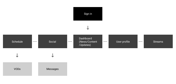
Design Process
With the user journey map laid out, I went straight into Figma to create a low fidelity mockup of the app while taking into consideration
1. User wants based on survey
2. Making important actions in the app clearer
3. Better flow between pages
After the low fidelity mockups were finished, I started on studying Riot's design language from their colours and fonts to their buttons in preparation for the high fidelity mockups. I took inspiration from their main website and combined it with aspects of the League+ app.


The new app:
1. Puts emphasis on important interactions that users used and wanted, such as the social tab that incorporates an organized way to message friends and spectate their games.
2. The ability to filter and search in many pages for quicker actions as well as being able to switch between games.
3. Removal of extra, unnecessary links/pages by integrating them with existing pages.
4. UI layout redesigned in some pages and implementation of light and dark modes.
Takeaways
This is my favourite project to date because I was entirely in control of the ideation and processes which allowed me to explore and learn new design styles. Not to mention that I am also very passionate about this industry!
I learned that sometimes, a redesign isn't meant to be something that is blown out. User needs and wants will range, but as long as I am able to cater to them by creating a great experience for them when using the app, then it is considered a successful redesign. Since this is also my first redesign project, I learned to show restraint as I could've changed elements that were not an issue in the first place.
The fact that I was designing an app for an already established company made me want to put in more effort in nailing down what users wanted. Ideally, I should have gotten a larger research sample to further back up my basis for my redesign. That way I can truly say that the app is more user friendly for the entire player base.
Rest of the mockups
